Mobile Forms
Basic improvements to mobile forms, with the intention of a larger overhaul of UX/UI work to follow.
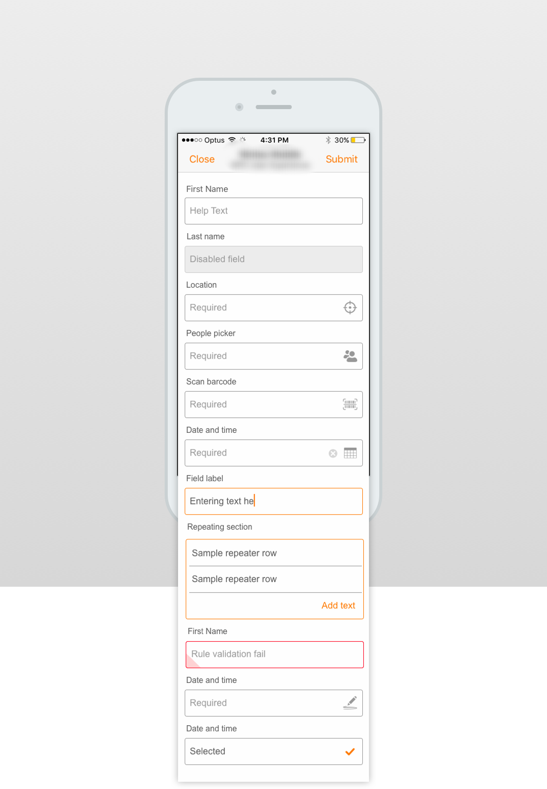
Before

The current mobile form features a heavy handed approach. Black labels, black key lines and some very tight padding between fields.
After

The new form features a few small tweaks such as greater padding between fields, variation between typography and introducing a selected state.
Mobile form research
Researching best practice form design.

Purchasing an accessory through Apple Store app.

Selecting and purchasing a ticket through Eventbrite.
Collaborative sketch session
A team sketch up session was conducted where we took a deep dive into the current form experience noting any usability issues.
Suggested improvements were documented and prioritised. These were discussed with the development team in terms of what was possible for the next release.
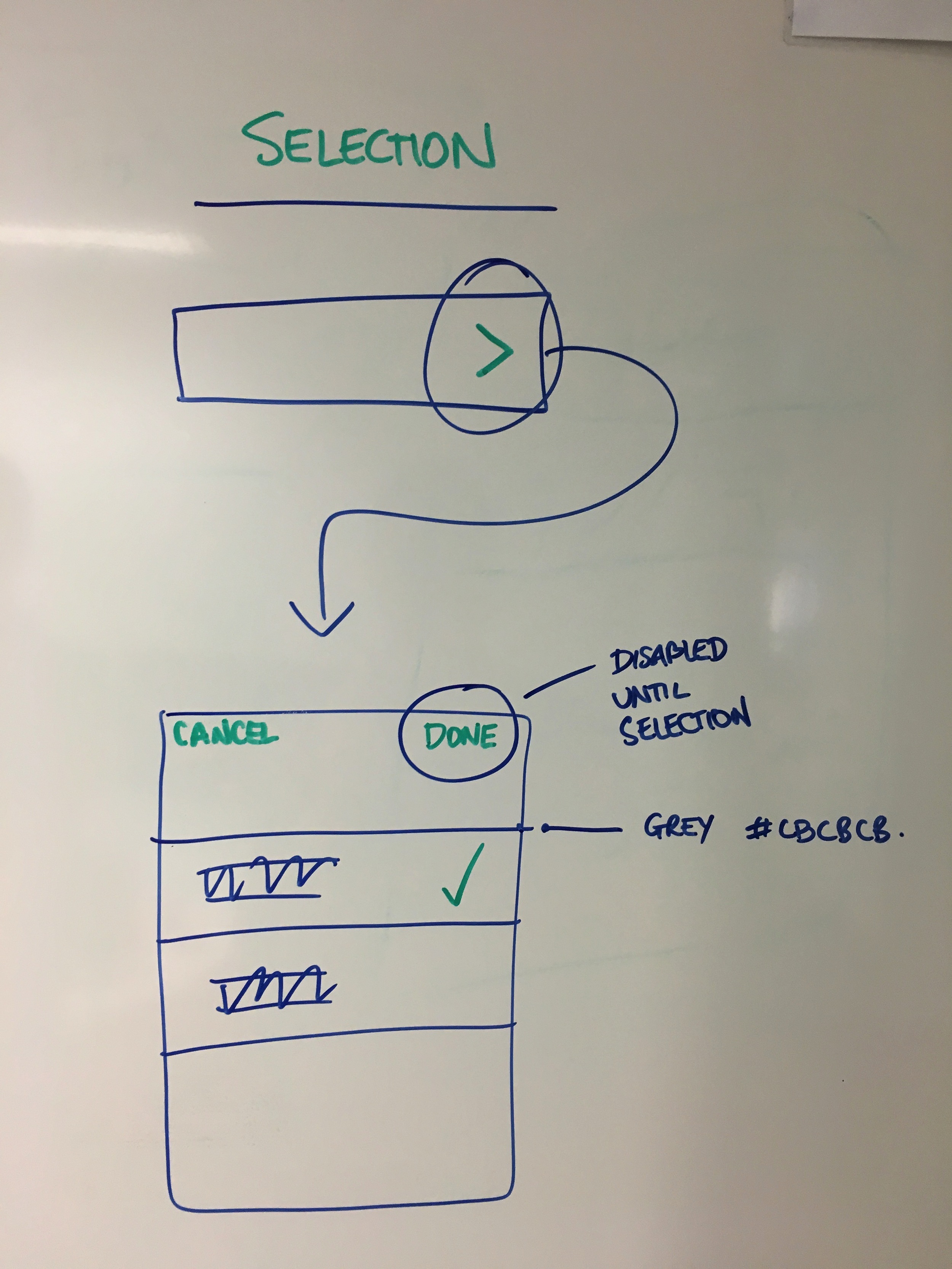
Selecting items from a list.
Suggested updates listed.

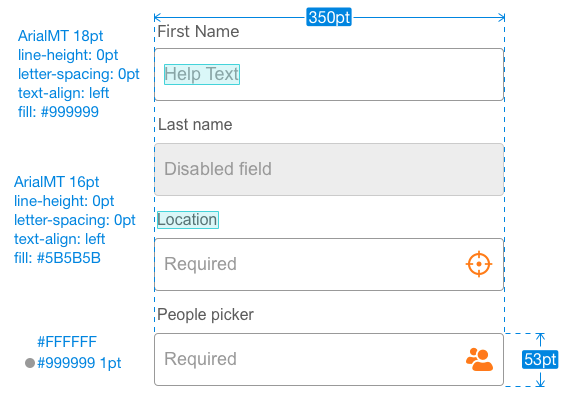
Design approach
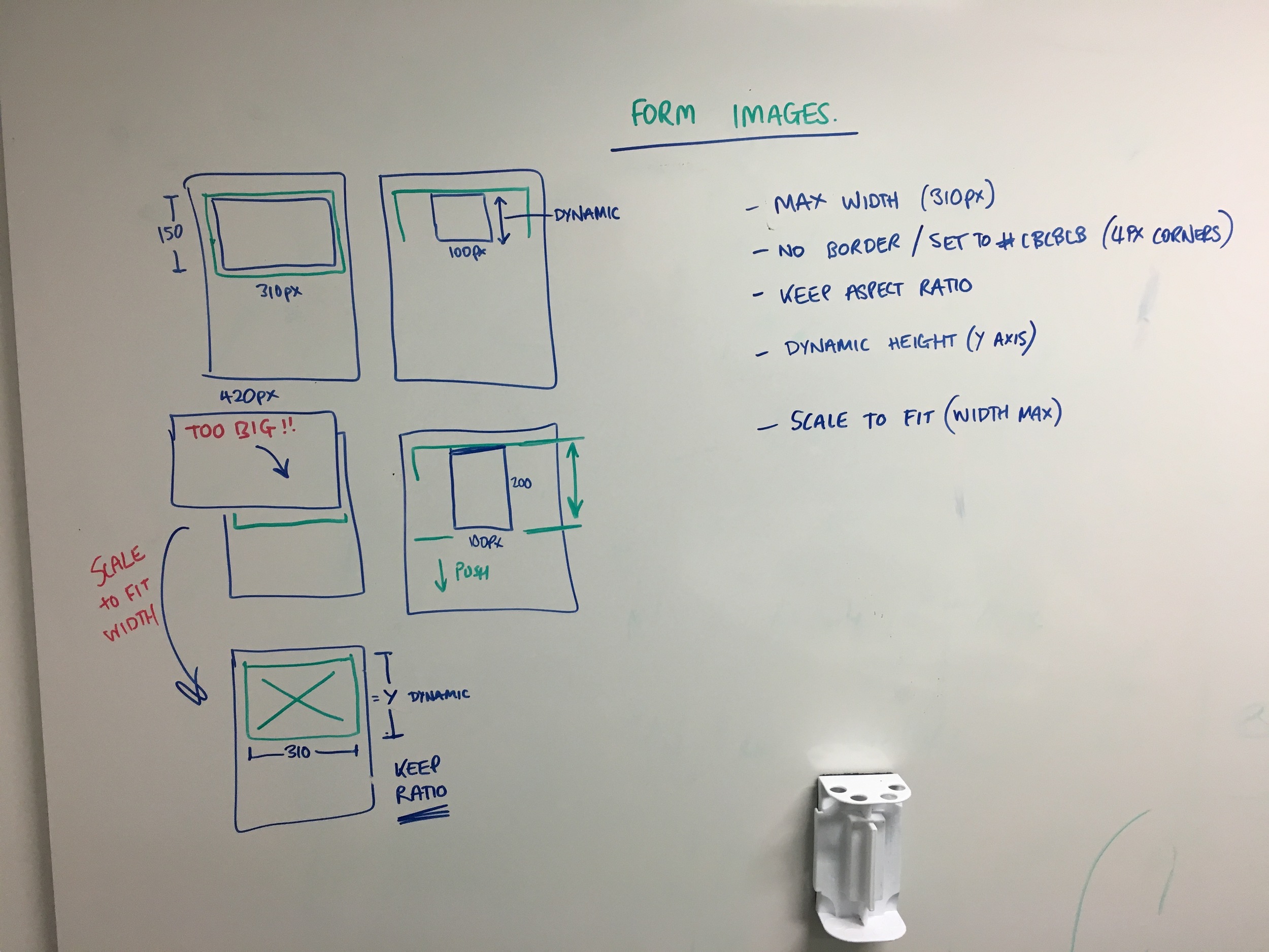
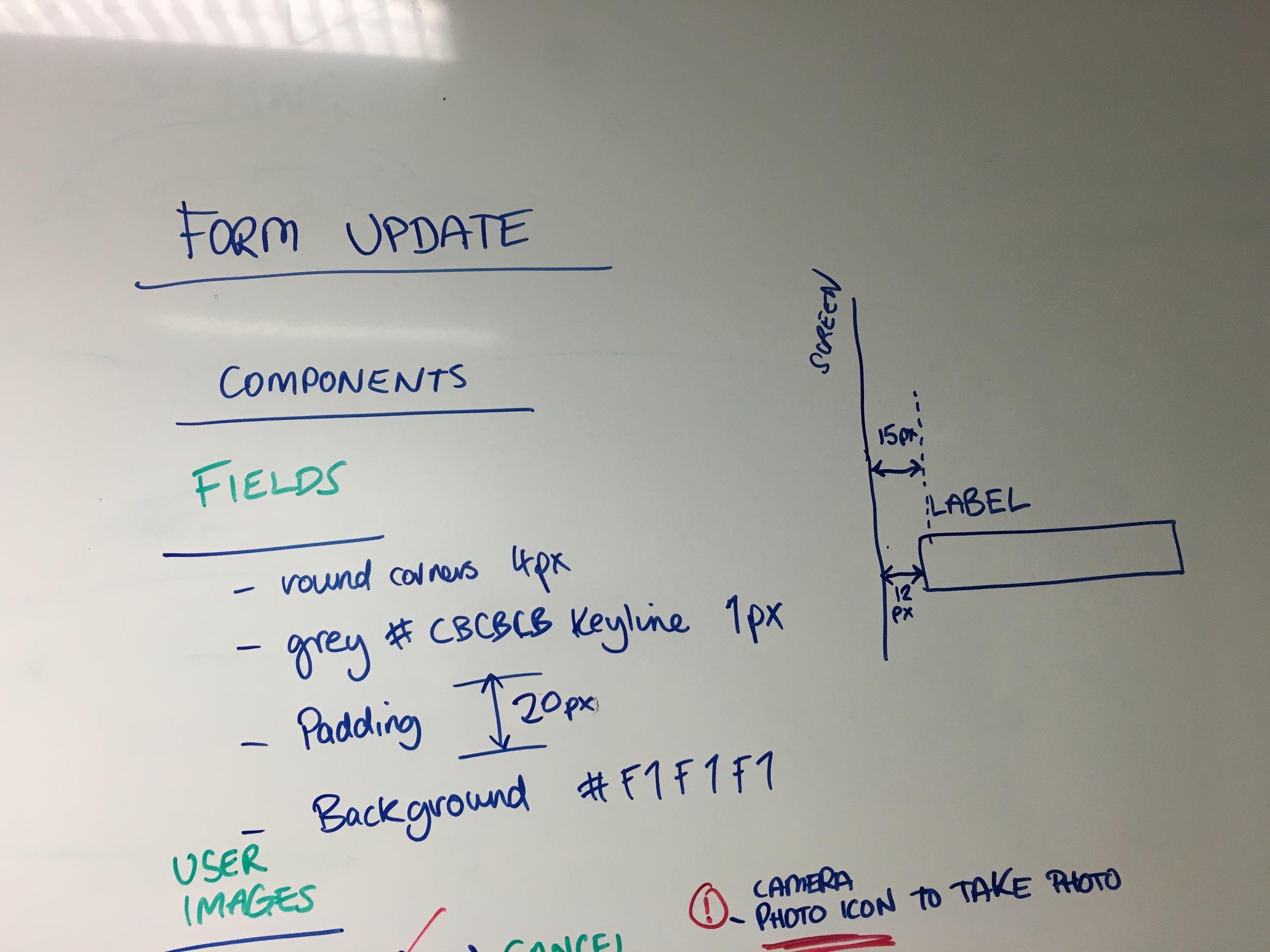
Annotated specs were provided to the development team. We looked at padding, typography and tested designs for legibility.


Final design and assets
After approving the design we compiled a list of assets for the new form for delivery to the development team.